
18 of 18 Items
18 of 18 Items
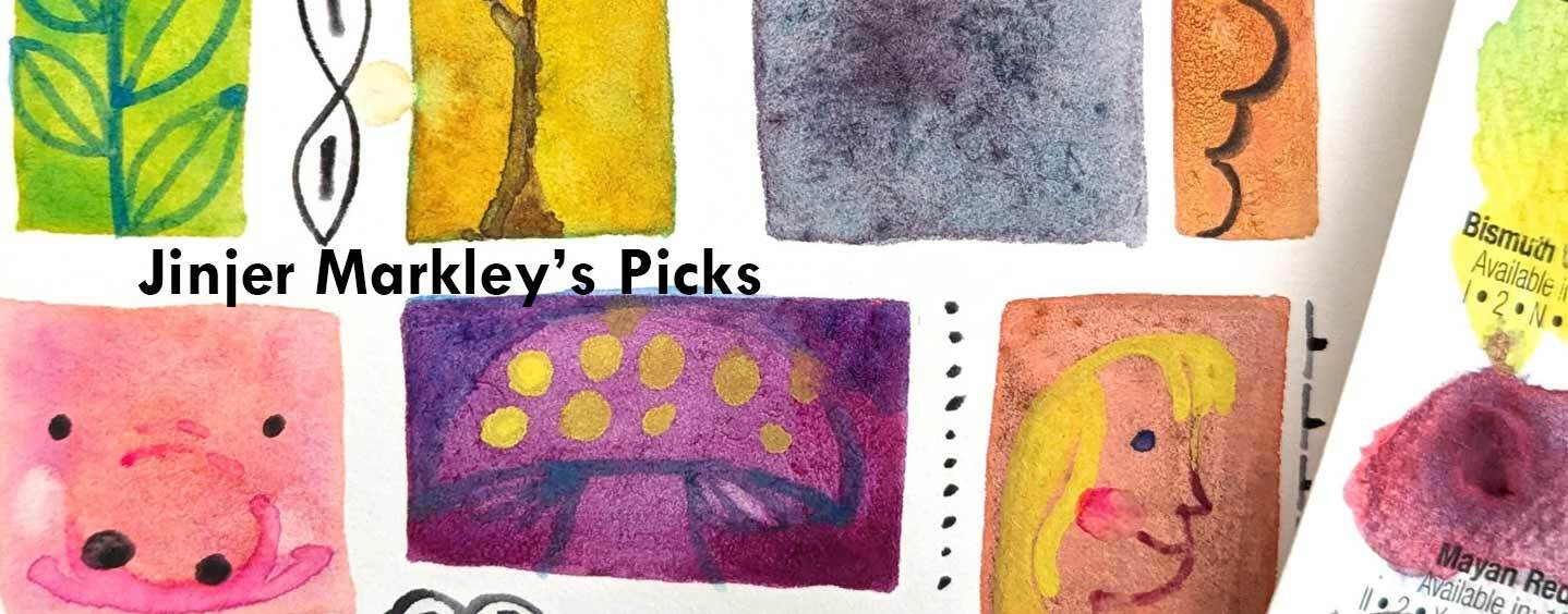
Introducing Jinjer Markley’s picks, now available from Wet Paint as a dot card of Daniel Smith watercolors!
Jinjer is a Twin Cities illustrator and instructor of color mixing and theory who has selected a palette of her “go-to” Daniel Smith colors.
"As a watercolorist, you not only get to play with color, you also get to play with texture! This dot card is all about color AND texture."
Note: Texture is most obvious when you paint a juicy wet swatch and let it dry naturally.
1 . Ultramarine Blue has a classic granulating texture—the color settles in granules. It is also brighter than any medium-blue you can mix. It's a sinker—I'll explain that later.
Granulating textures are most obvious when painted on cold-press paper.
2. Pyrrole Orange has a smooth texture—the color tends to spread evenly over the entire swatch. It is also brighter than any orange you can mix. It's a sinker.
3. Phthalo Green, YS has a texture I call drifting texture. It sometimes gets marked as granulating, and sometimes non-granulating, but it's different from either—the color tends to settle in drifts, rather than granules. Drifting texture is most obvious when painted on hot press paper. Pthalo Green is also a brighter green than any green you can mix, especially when dark. It is a floater—I'll explain that soon!
4. Moonglow is a mixture of colors specially formulated to look like grey from a distance and MAGIC up close. How did Daniel Smith achieve this magic? By mixing pigments with different textures and densities! I introduced texture with the first three paints. As for density, paints can be floaters or sinkers. Smooth or drifting floaters tend to mix together nicely, creating even color. Granulating paints and sinkers tend to settle out of mixtures, creating MAGIC. Try making your own magic!
5. Cobalt Teal Blue is a granulating sinker, and tends to settle out of mixes. It's also very close to the true primary color cyan, making it an unmixable color. It can be used to mix very bright greens. However,' it has a light masstone and low tinting strength, meaning it can't be used to mix dark, bright colors.
6. Cobalt Violet is a granulating sinker, and tends to settle out of mixes. It's close to the primary color magenta, making it an unmixable color. However, it has a light masstone and very low tinting strength, so it can't be used to mix dark, bright colors. For an interesting color experiment, mix it with a tiny bit of pyrrole orange to make a red.
7. Mars Yellow is a granulating sinker, and tends to settle out of mixes, but not as strongly as the first two. It also has a delicious, buttery painting texture that makes it a favorite on my palette.
8. Lunar Black is a granulating sinker, and tends to settle out of mixes, giving them a dramatic texture.
9. Opera Pink is a granulating floater. Mixtures will show very bright pink granules settling out of an otherwise evenly mixed color. It's also a super bright color, and close to primary magenta. Try mixing it with yellows to make super-bright reds.
10. Neutral Tint is is a smooth floater, it tends to mix nicely with other floaters to make smooth colors. You could call it "black" or "grey," but it's designed to mix with bright colors to dull them down.
11. Quinacridone Lilac is a smooth floater, it tends to mix nicely with other floaters to make smooth colors. It's also my favorite approximation of the primary color magenta. Opera Pink and Quinacridone Lilac are nearly the same hue, Opera Pink is just more chromatic. For an interesting color experiment, try mixing Opera Pink and Neutral Tint to match Quinacridone Lilac.
12. Hansa Yellow Medium is is a smooth floater, it tends to mix nicely with other floaters to make smooth colors. It's very close to the primary color yellow.
13. Phthalo Blue Turquoise is a drifting floater. It tends to mix nicely with other floaters to make colors with subtle texture. It's also close to the primary color cyan. Like all the Pthalo colors, it has an incredibly high tinting strength, so mix with caution: barely touching a wet brush to the Ptha/o Blue Turquoise dot will pick up enough pigment to equal the entire dot of Cobalt Violet!
14. Phthalo Turquoise is a drifting floater. I added it to the list because it's a great demonstration of the three dimensions of color. It's nearly the same hue as Cobalt Teal Blue, but has a darker value and less chroma. It's easy to see the value difference right on the dot card— Pthalo Turquoise looks nearly black. That means it can be used to mix darker greens than Cobalt Teal Blue. To see the difference in chroma, add Neutral Tint to Cobalt Teal Blue until it's the same color as dilute Pthalo Turquoise.
15. Pyrrole Crimson is a drifting sinker. It tends to mix nicely with floaters or sinkers to make colors with subtle texture.
16. Bismuth Vanadate Yellow is a drifting sinker. It tends to mix nicely with floaters or sinkers to make colors with subtle texture. Its light masstone and opacity makes it a rare yellow that will show up over darker colors when used thickly. To use thickly, repeatedly rub a damp brush over the paint dot until the texture of the paint on the brush is thick and creamy.
17. Mayan Red is is a drifting sinker. It tends to mix nicely with floaters or sinkers to make colors with subtle texture. I'm a fan of the Mayan colors, and the recent re-invention of this ancient technology is a fascinating story worth looking into.
18. Iridescent Electric Blue is a drifting sort-of-floater. It tends to mix nicely with floaters or sinkers to make colors with a subtle texture. It also gives any mixtures a dramatic shine when you view it from just the right angle.